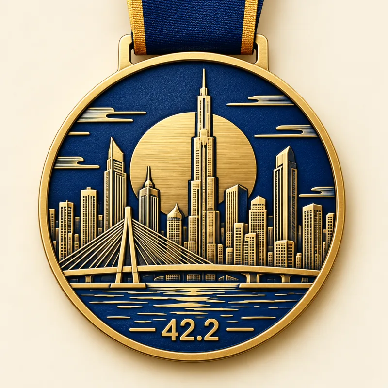
Skyline 42.2
A city’s silhouette. A runner’s milestone.
Explore this idea

Design inspiration
A marathon medal has one job before any other: it has to feel like the race it came from. Not a generic gold disc with a date stamped on it, but something a finisher can hold up in a photo and still recognise ten years later. Below are six designs from our own collection, each built around a different starting point, with the decision that makes it work and the way to adapt it to your event.
Each card opens the design in detail: front and back, the ribbon, and what can be changed for your own race.
A city’s silhouette. A runner’s milestone.
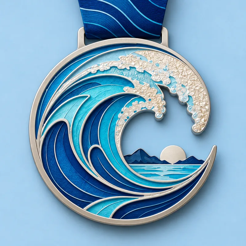
Bring the energy of the ocean to the finish.
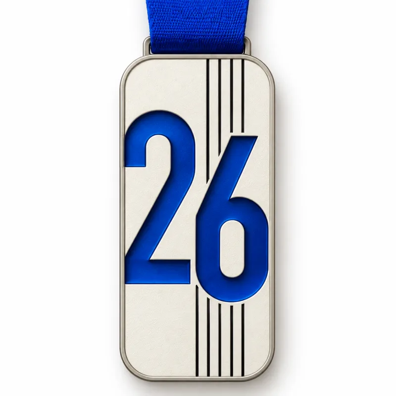
A quieter shape. A stronger statement.
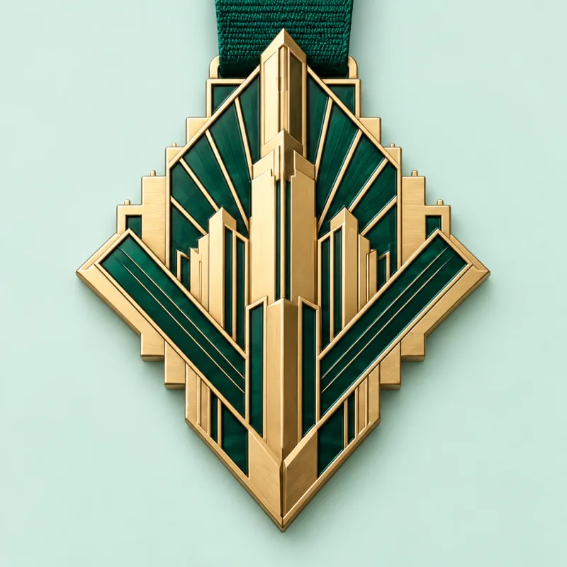
A grand finish with a golden-age spirit.
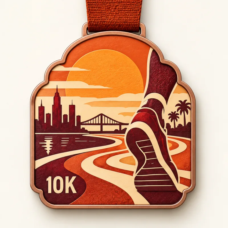
Easy miles, warm light, lasting memories.
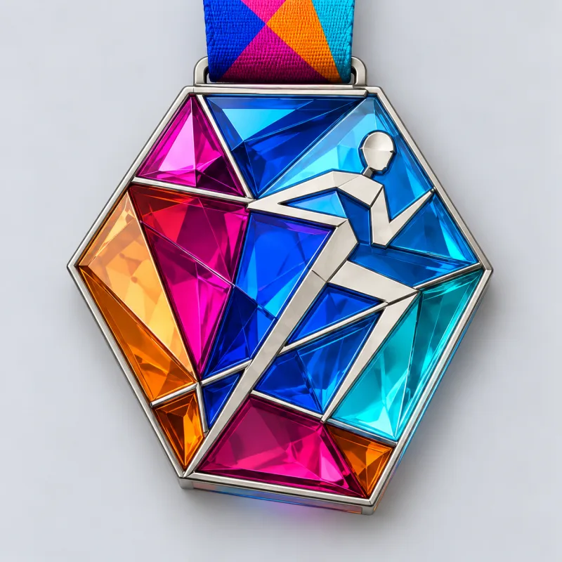
Let every mile catch the light.
The fastest route to a medal that could not belong to any other race is to start with the location rather than the logo. Skyline 42.2 turns the host city into a layered silhouette with a winding river, so the medal reads as this city before it reads as a medal. Coastal Miles does the same with a coastline: the wave becomes the outline of the piece, not a picture printed inside a circle, and three blue fields give it movement. Both work because a runner who travelled for the race recognises the view immediately.
If your course has one defining feature — a bridge, a harbour, a mountain pass, a stadium — build the shape around that feature and keep the rest of the face quiet. Place-based medals fail when the landmark competes with the event logo; they work when the outline itself is the landmark.
Distance and edition numbers are the most under-used design material on a race medal. Edition 26 makes the number the object: oversized cut-out numerals in cobalt on an ivory rectangle, with fine track lines running behind them. Nothing else is needed — the distance, the year and the race identity are all carried by the figure.
This direction suits anniversary editions, race series and any event with a number worth celebrating (a tenth running, a twenty-sixth mile, a fiftieth year). It is also the cheapest direction to keep consistent year to year: the numeral changes, the system stays.
A period style gives a medal a mood in one glance. Emerald Avenue borrows Art Deco: a stepped diamond outline, emerald enamel and champagne-gold rays, with a formal vertical axis. Sunday Run Club goes the other way, to a seventies travel poster — a scalloped copper arch, terracotta and cream, a stylised shoe and a winding route. Both are unmistakably medals, and neither looks like the other.
The trap with period design is pastiche. Pick one era and commit: one geometry, one palette, one lettering style. A medal that mixes deco lines with a modern sans-serif logo usually reads as a template rather than a design.
Prism Pace starts from translucent acrylic instead of metal: a faceted polygon with jewel-colour panels inside a fine silver-tone frame, so light passes through the medal on the course and in photos. Acrylic changes the weight, the colour intensity and the budget level at the same time, which makes it a decision about the object, not just the artwork.
The reverse direction — metal with more depth — works the same way. Die-struck relief, 3D sculpting, an antique finish or a plated edge all give the hand something to discover. Deciding the material early usually decides the design, because each process has its own limits on detail, colour and shape.
Road-race medals usually run from 1.5 inches to 5 inches in diameter, and the right size depends on how much detail the artwork carries. A skyline or a sculpted figure needs more surface than a numeral; a heavier, larger medal also feels more like a finisher award in the hand. Thickness and the ribbon width are chosen with the size so the piece stays balanced.
Most custom orders run about 10–15 business days from approved artwork and payment, excluding transit. That window starts when the proof is approved, not when the inquiry is sent, so the artwork stage is what decides whether the medals arrive before race day.
Yes. The front normally carries the event identity that stays identical for every finisher, and the back carries what changes — name, finish time, category, distance or year — applied by engraving or printing. Send the list as a spreadsheet: the proof is checked line by line before the mold is cut, because a name engraved on metal cannot be changed after production.
